

Matplotlib is a Python plotting library that machine learning experts mostly use to create static and interactive visualizations.
What is Matplotlib
Mathplotlib is a creation by John D. Hunter in 2003 that was released on 8 May 2021 and has a current version of 3.4.2.
This library is majorly written in Python, while the rest is written in C objective and JavaScript, making it platform compatible.
Matplotlib uses NumPy, which is a Python numerical extension. Its extension with NumPy adds its viability as an open-source alternative and makes it a better preference than MATLAB.
For Python GUI applications, Matplotlib allows the plotting of static plots on it using the object-oriented API it comes with.
Users can use only a few written lines of Python code to visualize their data using different plots, including scatter plots, histograms, bar charts, pie charts, line plots, and box plots.
You can use Matplotlib to create plots on environments including Python shell, Jupyter notebook,
Jupyter lab and also using Pycharm or Anaconda and on web application servers like Flask and Django across various platforms.
Like in MATLAB, you can extensively control the plots in terms of fonts, lines, colors, and styles.
After the brief introduction of the Matplotib library in Python, let’s see how we can set it up in our systems.
Setting up Matplotlib environment
Like any other Python package and library, you can install the pre-compiled Matplotlib library and its packages across all operating systems with the pip package manager.
Of course, it requires you to install Python and the pip package on your system first.
The following commands display the version of Python and pip to confirm whether these tools are installed already.
Check if Python is installed
Python --versionCheck if pip is installed
pip -VInstall Mathplotlib
The command below installs the Matplotlib package from the Python Package Index (PyPI).
python -m pip install matplotlibThis command downloads and installs the relevant packages of Matplotlib. You should see a successful installation message after the installation is complete.
To be sure that Matplotlib has been successfully installed, type the following command, which will display Matplotlib’s version in your command prompt.
import matplotlib
matplotlib.__version__
Developers wishing to install the uncompiled Matplotlib package must have access to the right compiler in their system, in addition to dependencies, setup scripts, configuration files, and patches.
However, this particular uncompiled Matplolib installation may be complicated, especially for Matplotlib newbie users. Therefore, why not just use a one-line command to install the library in seconds?🤔
After Matplotlib’s installation, import the package to your environment to access its utilities.
Matplotlib plotting options
Matplotlib provides numerous plotting options to visualize data. It also allows customization of the plots by providing different themes, colors, and palette options the user can use to manipulate the plots.
These plotting options include:
#1. Bar Graphs
Bar plots, famously known as bar graphs, are a suitable option for visualizing a quantitative comparison of values within the same category.
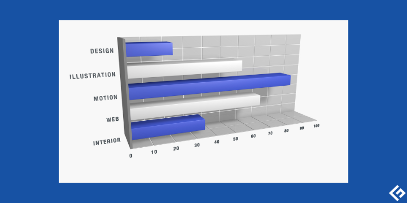
Matplotlib represents this plot using rectangular bars where their lengths and heights represent their proportional values. The bars can either be horizontal or vertical.
Matplotlib uses its plt.bar() function to create the bar plot.
Additionally, you can employ more functions to manipulate this plot. For instance, the plt.xlabel() and plt.ylabel() functions label the graph’s x and y axes, respectively.
The plt.title() function also allows you to give a title to your plot, while the plt.savefig() function saves the plot. The plot.show() function, which is the most important, displays the plot.
#2. Pie plots
You can visualize the items’ proportional distribution within the same category using a circular statistical plot we call pie charts.
Pie plots display data in percentage form. The chart’s entire area corresponds to the entire data’s percentage, while the individual pie slices represent sections of the data’s percentage.

Matplotlib uses the plt.pie() function which draws and adjusts the pie chart’s parameters.
More parameters like the autopct that print the pie chart value up to 1 decimal place are useful in plotting pie plots.
Business organizations find pie charts useful in presenting relevant information like operations, sales, or resources.
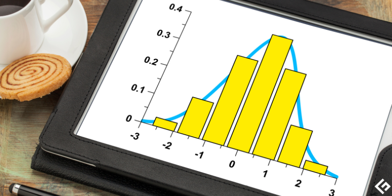
#3. Histogram
A histogram displays numeric data distribution. It uses continuous intervals to divide the data into distinct sections.
The main difference between a histogram and a bar plot is the type of data they handle. While histograms handle the continuous data type, bar plots handle categorical data instead.
Matplotlib uses the hist() function that uses an array of random or defined values to create the histogram.
#4. Line plots
These plots are useful in showing the relationship between two data values which we define as numerical and categorical, on an X and Y basis.

Line plots are significant in tracking the change of the data values over some time.
#5. Scatter plots
Scatter plots point out the relationship, including the correlation between the variables in the data. It is also useful in identifying outliers.
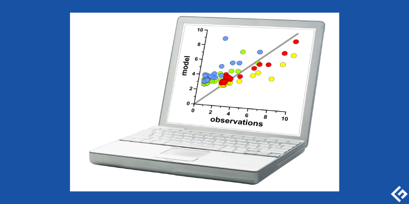
Scatter plots use dots to represent the relationship of the data variables and how a change in one variable can affect another.
How to create plots in Matplotlib
Matplotlib uses different functions to create different plots. It also uses very few lines of code to create the plot.
Below we see how to create the different plot options using different functions in Matplotlib.
#1. Bar plot in Matplotlib
Bar plots, as explained above, display data categories using bars and axes that represent a comparison of categories on one axis and corresponding values of the categories on the other axis.
The bar() function in Matplotlib takes different argument layouts to describe the bars’ layout, as shown below.
plt.bar(x, y, height, width, bottom, align)The x and y parameters represent the x coordinate values and y coordinate values of the bar in the plot. The width parameter represents the bar’s width, while the height parameter represents the bar’s height.
For example, let us represent the number of dogs and cats in an animal shelter called x.
import matplotlib.pyplot as plt
import numpy as np

x = ["Cats", "Dogs"]
plt.xlabel("Cats and Dogs in Shelter")
plt.ylabel("No. of animals in Shelter")
plt.title("Number of cats and dogs in shelter x")
y = [300, 350]
plt.bar(x, y, color ='black', width = 0.5)
Output:
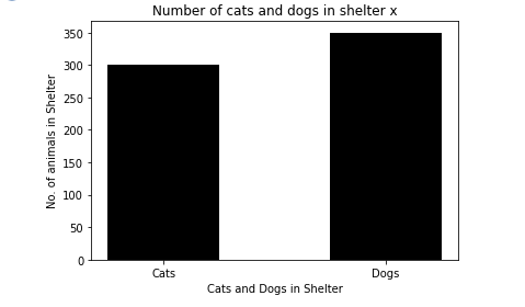
As in our example above, you can further specify the color of the bars using the color attribute. Moreover, the plt.xlabel and p.ylabel name the x and y axes, respectively while plt.title names the plot.
#2. How to create a pie plot
Matplotlib uses the pie() function that comes with the pyplot module to plot a pie chart.
The function represents the data to plot in array form.
Syntax:
matplotlib.pyplot.pie(data, explode=None, labels=None, colors=None, autopct=None, shadow=False)The colors parameter sets the color of the pie slices. You can use an array of values to specify a color for each slice.
To further include details of every slice in the pie, the autopct argument adds the numerical percentages that each slice represents using Python’s String formatting notation. The explode as an argument accepts an array of values that start from 0.1 to define the slice’s distance from the center of the pie.
Let’s plot a pie chart that displays resources in percentage allocated for a particular project.
import matplotlib.pyplot as plt
import numpy as np

y = np.array([25, 10, 45, 20])
mylabels = ["w", "x", "y", "z"]
explodevalues = [0.1, 0.2, 0, 0]
colors = ['tab:blue', 'tab:green', 'tab:orange', 'tab:red']
plt.title("Resources allocated for a random project")
plt.pie(y, labels = mylabels, colors=colors,explode = explodevalues, autopct='%1.1f%%', shadow = True)
plt.show()
Output:
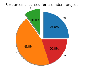
The plot above displays a pie chart with four slices labeled w, x, y, and z, respectively. The explode values define how farther away from the center of the pie the slices will be placed.
From the chart above, x is farther because its explode value is greater than the rest. The shadow attribute adds a shadow to the pie plot as in the image while autopct sets the relative percentage to the whole pie that every slice represents.
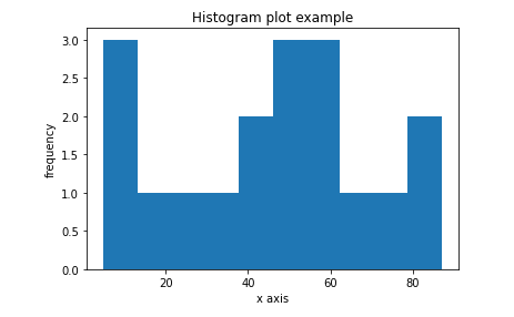
#3. Creating a Histogram plot
With a histogram, we will use a series of intervals to represent the range of the given values on the x-axis.
The y-axis, on the other hand, will represent the frequency information.
Unlike the other plots, plotting a histogram in Matplotlib requires some pre-defined steps you need to follow to create the plot.
These steps include:
- Create a bin of ranges from the set of data values you have. You can use the
np.random.normal()function that can generate random values for you. - Using a series of intervals, distribute values into a range of values.
- Count the values falling within every particular interval.
- Now use
matplotlib.pyplot.hist()function to create the histogram.
The hist() function takes in several parameters, including:
x – This represents the array sequence
bins – This is an optional parameter that represents non-overlapping intervals of variables that may contain integers or a String sequence.
range – It defines the upper, and lower range of the bins
align – This parameter controls the histogram’s alignment. Whether left, right or middle.
color – It defines the color of the bars.
rwidth – It sets the relative width of the bars in the histogram to that of the bin.
log – log parameter defines a log scale on the axis of a histogram.
The following example plots a histogram with the defined values.
from matplotlib import pyplot as plt

x = [22, 40, 87, 5, 43, 30, 56,73, 55, 54, 11, 20, 51, 5,  50, 60, 70, 80]

plt.hist(x)
plt.title(Histogram plot example')
plt.xlabel('x axis')
plt.ylabel('frequency')
plt.show()
Output:
#4. Line plot in Matplotlib
Matplotlib uses its sub-library called pyplot , which comes with various functions that help with its implementation.
We use the plot() function, which is a generic function that comes with pyplot to plot the line plots and different other types of line plots, including curved plots and multiple line plots. Creating these different kinds of plots depends on the values you pass to the y-axis.
When plotting, import matplotlib.pyplot and Numpy, which draw the charts. The plot(x,y) method creates the line plot by passing random values to the x and y arguments.
Additionally, you can pass a label variable that labels the plot. The title function further names the plot’s title, whereas the xlabel and ylabel functions name the axes. Finally, the show() function displays the plot.
For example:
import matplotlib.pyplot as plt
import numpy as np

x = np.linspace(0, 5, 10)

y = 3*x + 2
plt.title('Line plot example')
plt.xlabel('x axis')
plt.ylabel('y axis')
plt.plot(x, y)
plt.show()
Result:
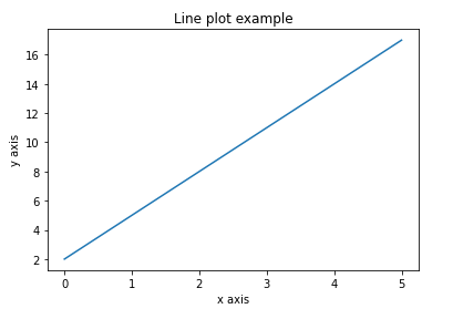
The np.linspace attribute returns on the plot, a set of evenly spaced numbers over a particular interval for the x values. This will create an array of 10 values in the range of 0 and 5. The y values are created from the equation that uses correspondent values of x.
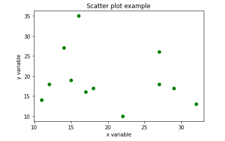
Creating Scatter plots
Matplotlib uses the scatter() method to create this plot.
This method takes in the following parameters.
matplotlib.pyplot.scatter(x_axis_data, y_axis_data, s=None, c=None, marker=None, cmap=None, vmin=None, vmax=None, alpha=None, linewidths=None, edgecolors=None) The x_axis_data and y_axis_data parameters cannot be left blank, unlike the rest of the parameters that can be optional and have None as their value. While the x_axis_data argument defines an array of data for the x-axis, the y_axis_data sets an array of data for the y-axis.
An example of a scatter plot in matplotlib
import matplotlib.pyplot as plt

x =[15, 17, 18, 27, 22, 27, 32, 14, 11, 12, 29, 16]

y =[19, 16, 17, 18, 10, 26, 13, 27, 14, 18, 17, 35]
plt.title('Scatter plot example')
plt.xlabel('x variable')
plt.ylabel('y variable')
plt.scatter(x, y, c ="green")

# To show the plot
plt.show()
Its output will like:
What is subplot() in matplotlib
The subplot() function can be used to draw multiple plots on a single Matplotlib figure. This allows viewing and comparison of the multiple plots within the figure.
This function will return a tuple with three arguments; rows and columns as the first and second argument, respectively, and the current plot’s index as the third argument.
The rows and columns clearly define the Matplotlib’s layout.
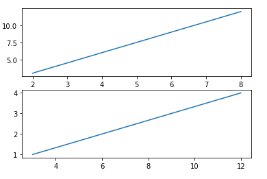
Therefore, plt.subplot(2, 1, 1) for example, will plot a Matplotlib figure with two rows and one column, and this plot will be the first plot.
On the other hand, plt.subplot(2, 1, 2) displays a second plot with two rows and one column.
Plotting these two plots will create them on top of each other, as in the example below.
import matplotlib.pyplot as plt
import numpy as np

#plot 1:
x = np.array([2, 4, 6, 8])
y = np.array([3, 6, 9, 12])

plt.subplot(2, 1, 1)
plt.plot(x,y)

#plot 2:
x = np.array([3, 6, 9, 12])
y = np.array([1, 2, 3, 4])

plt.subplot(2, 1, 2)
plt.plot(x,y)

plt.show()
The output of the above example will look like the image below.
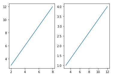
Using a different example, let’s use the subplot function to plot two figures with one row and two columns. This will display the plots side-by-side.
import matplotlib.pyplot as plt
import numpy as np

#plot 1:
x = np.array([2, 4, 6, 8])
y = np.array([3, 6, 9, 12])

plt.subplot(1, 2, 1)
plt.plot(x,y)

#plot 2:
x = np.array([3, 6, 9, 12])
y = np.array([1, 2, 3, 4])

plt.subplot(1, 2, 2)
plt.plot(x,y)

plt.show()
The above example will display the following result.
Well, that was interestingly interactive, don’t you think so?😃
Final Words
Matplotlib is a famously used visualization library in Python. Its interactivity and ability for ease of use even for beginners make it an even better tool to use for plotting in Python.
This article covered examples of the various plots that functions that come with Matplotlib can create, including pie plots, bar plots, histograms, and scatter plots.
Of course, Python has several other libraries that machine learning experts and data scientists can use to create visualizations.
You can explore more plots you can create with Matplotlib and what functions you will use to create the plot.
Happy plotting!📉📊
Si quiere puede hacernos una donación por el trabajo que hacemos, lo apreciaremos mucho.
Direcciones de Billetera:
- BTC: 14xsuQRtT3Abek4zgDWZxJXs9VRdwxyPUS
- USDT: TQmV9FyrcpeaZMro3M1yeEHnNjv7xKZDNe
- BNB: 0x2fdb9034507b6d505d351a6f59d877040d0edb0f
- DOGE: D5SZesmFQGYVkE5trYYLF8hNPBgXgYcmrx
También puede seguirnos en nuestras Redes sociales para mantenerse al tanto de los últimos post de la web:
- Telegram
Disclaimer: En Cryptoshitcompra.com no nos hacemos responsables de ninguna inversión de ningún visitante, nosotros simplemente damos información sobre Tokens, juegos NFT y criptomonedas, no recomendamos inversiones